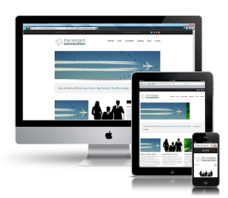
 Responsive web design is no doubt a big thing now. If you still not familiar with responsive design,
check out the list of responsive sites that I recently posted. To newbies, responsive design might sound a bit complicated, but it is actually simpler than you think. To help you quickly get started with responsive design, I've put together a quick tutorial. I promise you can learn about the basic logic of responsive design and media queries in 3 steps (assuming you have the basic CSS knowledge).
Meta Tag (view demo)
Most mobile browsers scale HTML pages to a wide viewport width so it fits on the screen. You can use the viewport meta tag to reset this. The viewport tag below tells the browser to use the device width as the viewport width and disable the initial scale. Include this meta tag in the <head><meta name="viewport" content="width=device-width, initial-scale=1.0">
Internet Explorer 8 or older doesn't support media query. You can use media-queries.js or respond.js to add media query support in IE.
<!--[if lt IE 9]>
<script src="http://css3-mediaqueries-js.googlecode.com/svn/trunk/css3-mediaqueries.js"></script>
<![endif]-->
HTML Structure
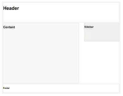
In this example, I have a basic page layout with a header, content container, sidebar, and a footer. The header has a fixed height 180px, content container is 600px wide and sidebar is 300px wide.
Media Queries
CSS3 media query is the trick for responsive design. It is like writing if conditions to tell the browser how to render the page for specified viewport width.
The following set of rules will be in effect if the viewport width is 980px or less. Basically, I set all the container width from pixel value to percentage value so the containers will become fluid.
The following set of rules will be in effect if the viewport width is 980px or less. Basically, I set all the container width from pixel value to percentage value so the containers will become fluid.
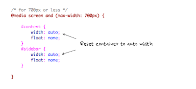
Then for viewport 700px or less, specify the #content and #sidebar to auto width and remove the float so they will display as full width.
For 480px or less (mobile screen), reset the #header height to auto, change the h1 font size to 24px and hide the #sidebar.
You can write as many media query as you like. I've only shown 3 media
queries in my demo. The purpose of the media queries is to apply
different CSS rules to achieve different layouts for specified viewport
width. The media queries can be in the same stylesheet or in a separate
file.
Reference : Web Designer Wall


Hi,Designing a web site isn't very hard, but there are some basic things that you need to know about Web Design Cochin or your web site could turn into the biggest horror.Thanks.....
ReplyDeletes this type is travel
ReplyDeletereal estate nepal
travel is very us in
ReplyDeleteseo in nepal
I ADAMS KEVIN, a representative Aiico Insurance plc, we trust and respect for individual differences in day out a loan. We will provide 2% of the loan's interest rate. If you are interested in this business contact us by e-mail: (adams.credi@gmail.com) now transfer their loan documents issued properly. Do you need a loan to set up business or school if you are very welcome to Aiico Insurance plc. You can also contact us by e-mail: (adams.credi@gmail.com). We first week can request a balance transfer.
ReplyDeleteDO YOU NEED LOAN FOR PERSONAL BUSINESS? IF YOU CONTACT YOUR EMAIL ABOVE TO PROCEED WITH YOUR LOAN TRANSFER IMMEDIATELY OK.
I wanted to thank you for this great read!! I definitely enjoying every little bit of it I have you bookmarked to check out new stuff you post.
ReplyDeletewordpress web design